Only in Theory...


I passed my theory test last week (yay!) and with an obligatory Facebook status announcing it to the world, I decided that what better than to create a greeting card design. Why not have one congratulating you on passing your theory as well as your practical test!?

Unfortunately the words are not mine, but of a friend who had commented upon my status. Every little bit of inspiration. Cheers Chris! ;)

Here Comes Santa Claus


'Here Comes Santa Claus'

Pattern experimentation, playing around with the 'Santa Claus' illustration I posted yesterday.

<a href="http://www.bloglovin.com/blog/8988937/?claim=e3jp2pqfh5p">Follow my blog with Bloglovin</a>

'New Arrivals' Exhibition


Three weeks today sees the beginning of The University of Gloucestershire School of Art & Design's Degree Show. The Graphic Design students are putting on their exhibition entitled 'New Arrivals' in The Design Studio at Francis Close Hall Campus, Cheltenham.

A lot of time and effort has already been put in by the students for the planning of the show, whilst also working hard on their personal projects and the building of their individual portfolios.

If you would like to see what the designers of the future have to offer, we would love to see you at our show - running from Saturday May 26th - Thursday May 31st. Invites for the private viewing on Friday May 25th will be sent out shortly!

For more information and updates on the progression of the exhibition, follow us over on Twitter: @UOGDegreeShow

Rusky Business

I didn't think I would enjoy doing a packaging project, but so far I am absolutely loving it. It may be the fact I've chosen something which allows me to bring out my inner child or the fact I feel confident with the work I'm producing for it so far.


I have got the three basic components to the packaging down and now just need to concentrate on the placement of the text and illustration. My tutorial feedback on Wednesday was really helpful and have been told that I need to have a play around with some of my ideas and the overall composition.

Today I have been working on some animal illustrations which I hope to incorporate onto the front of the packaging. I wish for each flavour to be associated with a colour and a character, making the product more appealing and suited to the target audience.

The Final Stretch

So this is it, my last ever term in education. Ever. I'm not quite sure yet how I feel about this. Part of me cannot wait to get into the 'real' world and start earning, hopefully with a job that I absolutely love! The other part of me is quite sad at the thought of saying goodbye to Cheltenham and my own place. What I do know is that I have spent enough years being educated now and the beginning of the rest of my life is just around the corner.

After a lovely Easter at home it's back to being focused and cracking on with the final leg of work - three self-initiated projects and one project to create a piece of merchandise to be sold at our degree show. I have already got the majority of work done for one of my self-initiated projects and have started noting down my ideas for the second.

 
Packaging is something I haven't really done much of over the past three years and with the chance to build up my portfolio with the last few projects I think it will be a great addition to my work. I'm hoping to create new/limited edition packaging for Heinz Farley's Rusks. As my housemate put: "The colour of the packaging screams 'old person'," and she's right. So much could be done for such a popular children's food product and I want to bring it to life, to make it more appealing to both parents and their children.

Creating a Difference

Finally have some work to share with you after almost a month of nothing! Aside from working on a concept for our degree show, I have been completing the creating a difference part of the module. This part focuses on self-promotion and asks us to create a personal identity (seen now as my header at the top of the page), a creative strategy document, a blog/website concept, a piece of direct mail and a portfolio concept.

At the beginning of the module I was completely thrown by the whole self-promotion thing. Although it's a vital part of becoming a designer, I had never really had much luck with trying to find the right 'look' for myself. I think the hardest thing is having to promote yourself, being able to get across the right message about who you are and how you like to work. Saying that, I have now completed this part of the module and I am pretty pleased with my outcome for each piece.


The above set of photos show my idea for my direct mail. I have been looking into Medical Illustrator and Graphic Design jobs within the NHS, and also with having work experience within this field already I am swayed somewhat into heading in that direction once I have finished university. I believe it would be a good way of gaining relevant experience. For my piece I chose to create a 'First Aid Kit (for designers)', including all the essentials to help any designer and any mishaps they may come across. In the kit also I have included my CV. I stuck with a plain and simple design as not to overwhelm and have used a QR code in place of a barcode to link any prospective employers to my blog.

I have a few more tweaks to do for the pdf presentation on Thursday, but apart from that have everything completed!

Wot r u doin?

Revive the power of the written word. Why? Recent surveys indicate that SMS txtn is impacting on young people’s ability to spell correctly and read and write above a 5th grade level :(  And get this - in George Orwell’s dystopian fiction “1984”, he foresaw that excessive usage of short words would lead to reduced intellectual and linguistic capacity, damaging both the English language and our inclination to use a range of words to express a feeling.
Fix it.

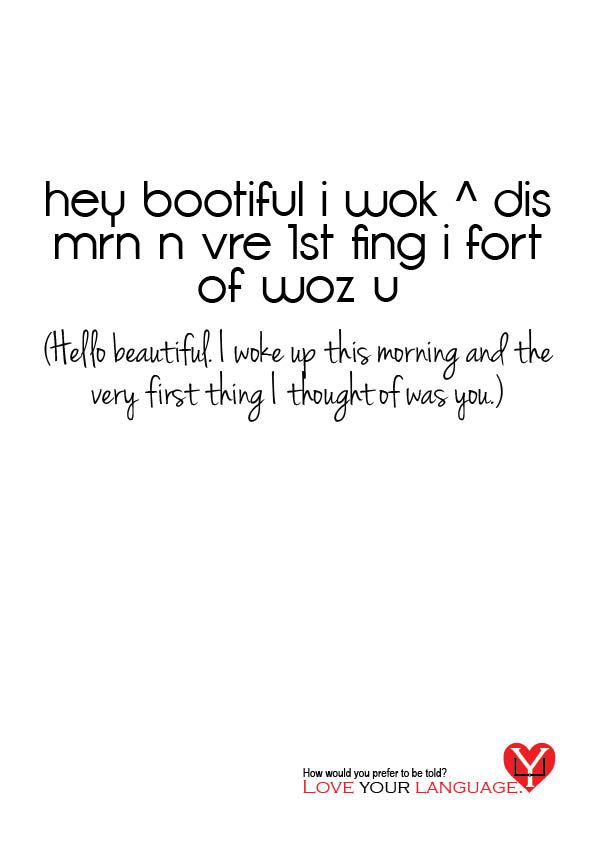
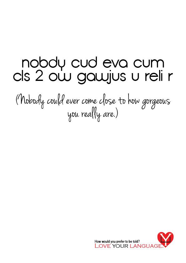
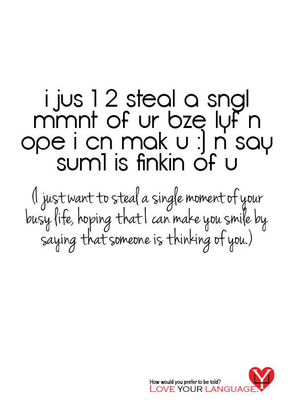
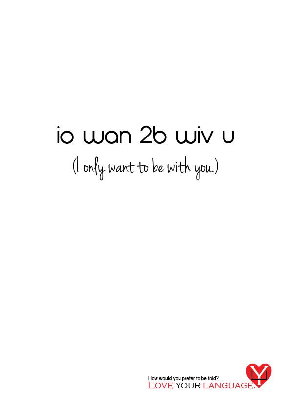
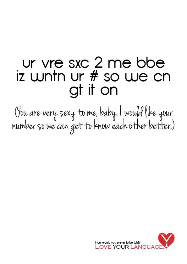
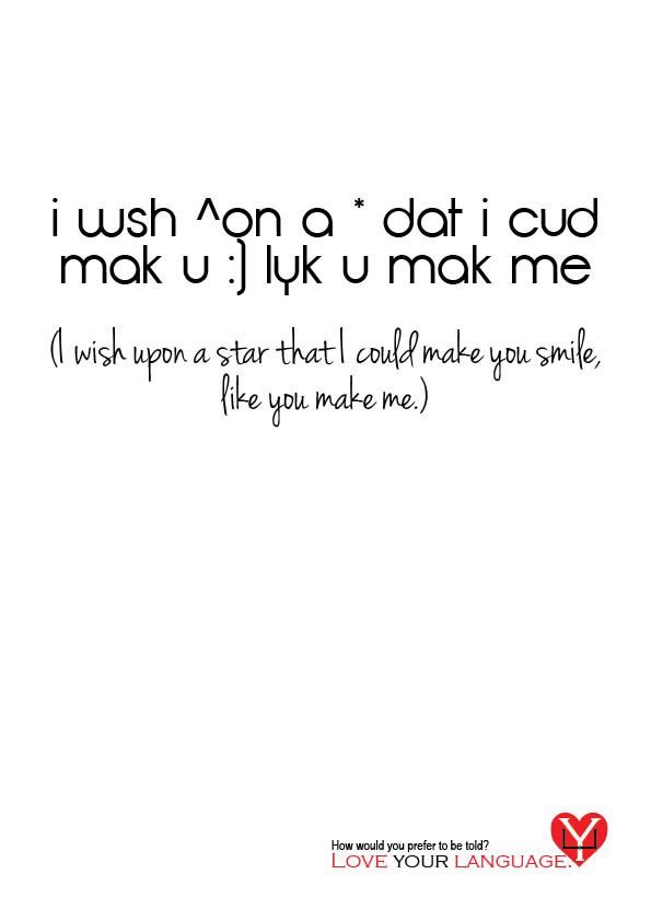
The second Roses Student Awards brief that I chose to do was Wot r u doin?. Language is an important part of all of us and I cannot stress enough at how much of a pet peeve text speak is to me. In response to this brief I produced a series of posters along the theme of 'Love Your Language'. I wanted my posters to be seen by the public; at bus stops and on billboards, and alongside my theme and the run up to Valentines Day, I used a selection of romantically focused SMS messages as the focal point to my posters. Two versions of the same message appear, with the prose version beneath the text speak. The idea is to make the viewer think about how they would prefer the message to be told to them.

Sprout Clout

Possibly the world’s most hated vegetable?! It’s your brief to make Brussels Sprouts the coolest veg on the planet, so your client can sell sack loads of them all year round and not just at Christmas! Think through the line.

One of my four choices for the Industry Awards module was the Sprout Clout brief given by the Roses Student Awards. From my initial research I found that the main reason why people have such a dislike towards this vegetable is because of overcooking, commonly found from boiling the sprouts for too long. This leaves a rather unpleasant taste that is liked by very few people. Because of this I set about trying to address the problem, looking into other methods of cooking that can help to retain the fresh taste and encourage people to introduce sprouts into their daily meals.

Through a series of illustrations I created a character out of the vegetable and placed it in the environment of other cooking methods, creating a quirky response that emphasises the idea that sprouts don't just have to be boiled. My characters include a disco-dancing microwaveable sprout; a relaxed, roasted sprout; a daring sprout, doing the wall of death in a wok; and a sprout who is enjoying a steam in a sauna.

These illustrations were part of a conceptual poster campaign, working alongside the National Junior Horticultural Association to promote the vegetable.

Drive + Little White Lies

I've almost completed my illustration for the D&AD Little White Lies brief. After many trialed sketches I felt that my work wasn't cutting it; I simply couldn't just enter a graphite drawing. Thinking back to some of my design work back at college I remembered a painting style that I had used for one of my FMP experiments and gave it a go. If it had not have turned out to my liking then I could always go back to my sketches and develop them (in a flood of tears and despair!). Fortunately I am really pleased with how it is looking.


Each half of the portrait shows a different side to Driver's character. On the right I have illustrated his stunt mask which I shall later edit to appear quite dark, showing his deeper, revengeful side that comes from his wanting to protect the object of his desire and her beloved son. On the left I have kept it quite simple, illustrating his main role in the film. I wanted to be able to hint at the deep emotions of the character by splitting the portrait in to two halves.

Overall I am really pleased with how it looks. I'm currently just waiting for the paint to dry before I can start editing it, ready to see how it appears in cover form.

Grimm Ideas


One of the briefs I am currently working on is the Puffin children's prize for this year's Penguin Design Awards. The brief is to redesign the cover for the classic Grimm's Fairy Tales by Jacob and Wilhelm Grimm, targeting a new generation of readers and encouraging both children and adults to revisit it time after time.

Over the past couple of weeks I have been playing around with a couple of ideas, using key items and phrases from each tale as my starting point. I wish to incorporate imagery from every tale told by the brothers into the one design. Above shows my initial sketches for the brief which I am now developing into my final piece. Really pleased so far with how it is coming together and I plan on completely hand illustrating to give it a personal touch and emphasise the different textures of the image.